In my last post, I introduced you to the next big project we’re tackling: the home office. For more about the inspiration and goals we have for the room, check out my last post.
This week I’ll give you a sneak peek at the progress we’ve made so far.
Here’s a picture of the room before painting:

Painting the walls was first on the list of things to do. The room was the same color as the rest of the house—a warm off-white color. I think the color looks great in the main areas of the house, but in this room, it just looks drab.
Paint Color (Here We Go Again!)
To support a warm feeling, we wanted something a tad darker. Originally, I was thinking of a medium or darker warm gray, but because darker colors tend to make a space seem smaller, I decided to go lighter on the walls than originally planned. However, because the room has 10-foot ceilings rather than the traditional 8-foot ceilings, I’ve decided to add a wooden ceiling that’s darker than the walls.
But first, paint.
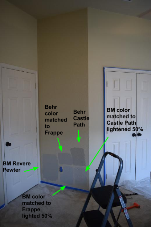
I explored tons of gray paint colors! After hours of staring at the plethora of small paint samples on the wall, I finally narrowed it down to these warm grays:
- Benjamin Moore Revere Pewter
- Valspar Frappe
- Behr Castle Path
My Confident Choice
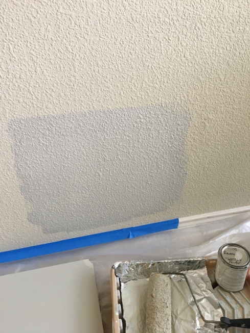
My favorite was Revere Pewter. I had a sample of Revere Pewter that was left over from my exploration of grays for the formal living room accent wall, so I painted a sample board. I was happy with how it looked when I taped it on the wall. I learned my lesson from my repainting experience before, so before going out and buying gallons, I tested the sample on the wall. Before painting it, I joked to my husband, “Watch it look blue.”
I opened the can, and the color looked like a light brown. Looks good! After it dried, I checked back.
I was shocked!
This was supposed to be a warm gray, but it looked like a blue-gray! What is going on with my walls to make every paint color look blue? Am I the only one that has this problem?
I researched forums online and found others who had a similar beige off-white color on their walls and when they painted Revere Pewter over it, it also looked blue. Some said it’s the surrounding color (the yellowy off-white) that makes the gray look blue. So I stuck white pages up around the color to counteract the off-white.
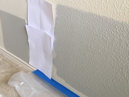
It looked less blue, but still looked like a gray with a blue undertone. I don’t know if it was the texture on the walls versus the smooth texture on the sample board or if it was my eyes, but it didn’t look like a warm gray to me.
Back to the drawing board.
My Next Choices
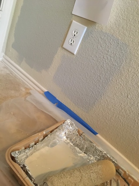
I loved using Benjamin Moore paint last time, so I bought 2 more samples:
- Color-matched to Valspar Frappe lighted 50%
- Color-matched to Behr Castle Path lightened 50%
I read that you have to lighten paint to 50% to really make a difference in a shade, so that’s what I did with these two samples.
I’m not sure what happened, but it got really light. And Frappe, which looks even browner on the paper sample than Revere Pewter…looked very similar to baby blue.
I’m glad I tested paint samples on the wall before buying gallons of paint!
My Next Choices After the Other Choices
Since both of those looked worse than the original Revere Pewter, I decided to go full strength color in the same brand so there’s no confusion. I have used Valspar before and wasn’t a fan, so this time I decided to use Behr for Castle Path and have them color-match Frappe. The cool thing about Behr is you can get the paint sample in the exact same type of paint that you plan to purchase. Several other brands have one base they use for all the samples. It’s supposed to be the same, but the sheen and base can make slight variations in the final color.
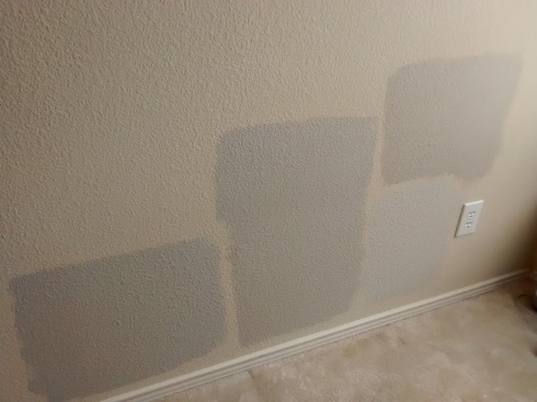
The new paint samples looked much better. Here’s a picture of the paint samples.
I ended up painting over the Frappe lightened to 50% because it looked so blue.

Our Chosen Color
After hours of deliberation and changing my mind several times, I went with my gut.
And my gut said…….
Castle Path!


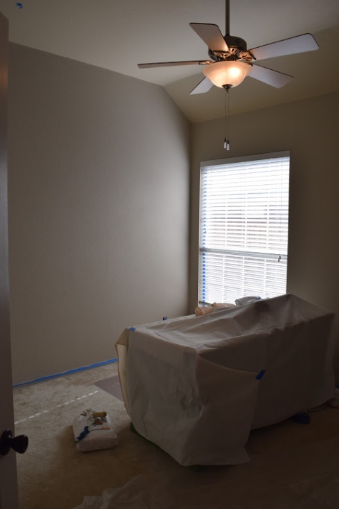
It looked the warmest out of all of them. The tone changes throughout the day and with the lighting. In the afternoon and when we have the incandescent light on, it looks taupe. In the morning, it looks gray. We both love the color.
However, we must thank our friends from Florida for inspiring us on the color! When they lived in Texas several years ago, they painted most of the walls in their house Castle Path and I loved how the color changed from gray to brown depending on the lighting. I never forgot that color. So here’s a shout-out to Hal and Ashley! Thanks for the inspiration, guys!
The Desk
You may have noticed something covered up in a sheet in the pictures. That’s THE DESK. I’m pretty sure it’s the best desk in the world, but I could be a little biased. It’s a sit-stand desk we made from scratch—I say “we” but I really mean my hubby. I just refinished it and contributed ideas and input.
We’re not professionals. We don’t make furniture for a living and we don’t have fancy tools to work with or a shop to work in. We just make things to fill a want and because we can.
Here are some other projects we have planned for the room:
- Wood planking the ceiling
- Building an industrial bookshelf
- Transforming an antique fire extinguisher into a lamp
- Refinishing an old side table
- Refinishing a couple of chairs
- Creating a cornice board
Stay tuned for updates to this room and a reveal of this super cool desk!
Speaking of projects and updates, this post marks my 12th weekly post since starting this blog! Going forward, I’ve decided to start posting monthly. I may have some intermittent posts in-between, and I’ll still be posting to Facebook and Pinterest so if you haven’t already followed me there, what are you waiting for? 😉
Feature photo: RhondaK Native Florida Folk Artist

I had no idea different brands of paint could make such a difference in staying true to a certain color or change into a totally different hue. However, many years ago when my husband was out of town and I had put our children to bed, I painted a large living room wall a beautiful gray blue. The next morning I walked into the living room to see a glowing bright blue. 😳 Wish I had known then the great tips you have just shared. 🙂
LikeLike
Undertones can be so tricky!
LikeLike